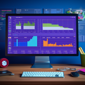
Data Visualization in Excel
Learn how to create a range of visualizations in Excel for different data layouts, ensuring you incorporate best practices to help you build dashboards.
Building basic Charts
You will embark on an immersive exploration of basic Excel charts, equipping yourself with the skills to create impactful visualizations and customize chart types. Through a comprehensive understanding of Series and Categories, you will gain the expertise to transform data into compelling narratives that resonate with your audience.
Advancing to more complex charts
Ready to further enhance your charting skills with Excel? You will explore how to work with dual series and prepare more advanced charts, such as Bullet charts, Waterfall charts, or Scatter plots. Additionally, we will investigate various chart editing options.
Data Visualization best practices
Like any discipline, data visualization has its best practices, and it’s time to take a closer look at the dos and don’ts. We will improve our skills in selecting chart elements, applying colors, legends, and labels, while also learning how to troubleshoot and customize poorly designed visuals for the benefit of end users.
Visualizing disaggregated data with PivotCharts
Get ready for an exciting journey into the world of visualizing disaggregated data! We’ll explore PivotTables, PivotCharts, and how to combine them into a dynamic mini-dashboard. Are you ready to unlock the true power of your data?


There are no reviews yet.